Visualising sound 05
EQ diagrams
- Video
- Script
Welcome to this tutorial on EQ diagrams.
EQ diagrams are similar to the frequency response diagram. They use a simple line to plot the shape and amount of cut or boost to a range of harmonics or frequencies. Because EQ devices usually contain multiple filters of differing types for bass, mid range and treble, it is common for each filter's actions to be represented by an individual diagram in the EQ device's manual.
EQ diagrams are primarily used to ..
- show the range of cut and boost that an equaliser's filters can achieve, or it's scope
- and to show the current settings of an equaliser's filters
EQ diagram elements
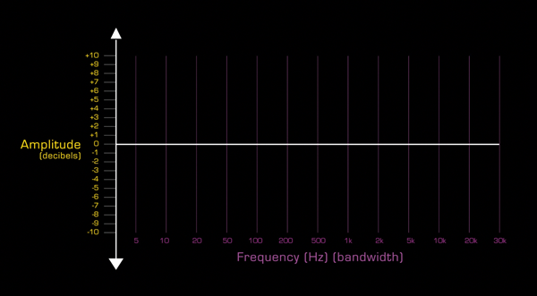
Like the frequency response diagram, the EQ diagram has two axis, frequency and amplitude.
- Because human hearing extends between 20Hz and 20kHz, the frequency axis often reflects this range, but it can be wider or narrower.
- The amplitude axis will have a bi-polar display with a scale in decibels showing which frequencies have been boosted and which cut. This axis may be called amplitude, cut and boost, or gain.
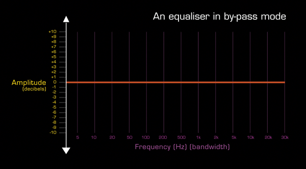
A horizontal line, plots the amount of cut or boost. This example shows an equaliser in by-pass mode, which means it is set to neither cut or boost any of the frequencies in an audio signal passing through it.
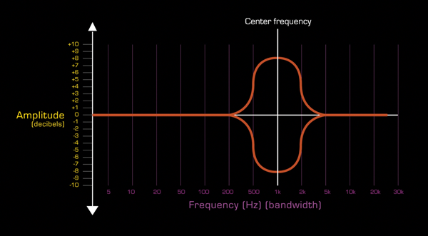
A vertical line indicates either the centre frequency around which a band-pass filter is operating, or the cut off point for a shelving or hi-pass or lo-pass filter.
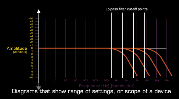
Caption - Range of settings, or scope, diagrams
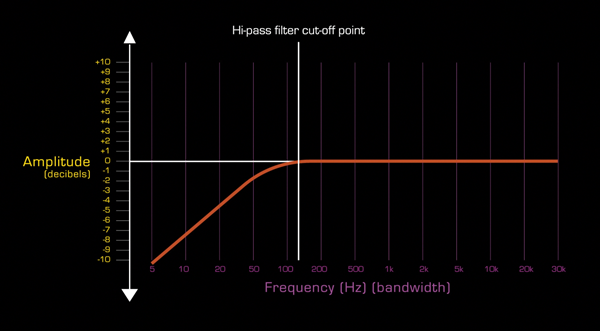
This diagram shows the action of a low pass filter, including the range of frequencies that the cut-off point can be set to.
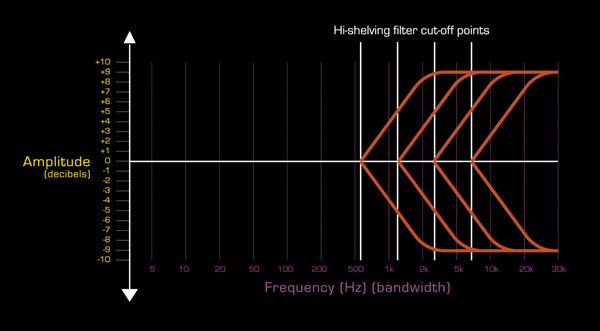
This diagram shows the action of a hi-shelving filter including the range of frequencies that the cut-off point can be set to, and the maximum cut and boost that can be applied.
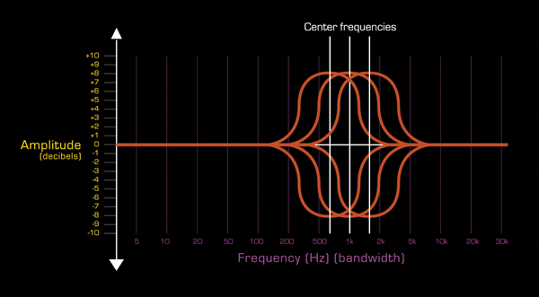
Band pass filters diagrams will show the bandwidth, or range of frequencies, that can be affected, the amount of available cut and boost, and the available filter slope or Q settings. This digram shows the range of frequencies, or band, that a mid-range band-pass filter can affect, and the maximum amount of cut and boost available.
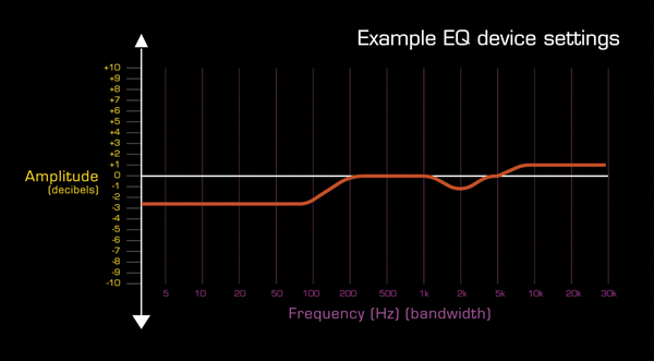
Caption - Example EQ device settings
This example shows the settings for a three filter equaliser. At these settings, a sound wave passing through it will have it's frequencies below 200Hz cut, frequencies at 2kHz turned down and all frequencies above 5kHz boosted a little.
Caption - Filter slope
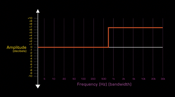
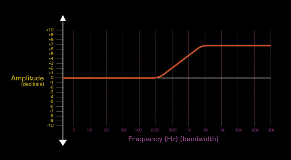
It is both technically challenging and aesthetically undesirable to design filters with cut-off points that are immediate. Therefore a filter's cut-off point always has a gradual slope to its action. This slope is represented in the diagrams by a gentle curve. How steep this curve is will depend on the design of the equaliser and the settings of any available controls.
Caption - EQ plug in diagrams
Some plug-in technologies combine EQ diagrams and animated frequency diagrams to show both the setting of the plug-in and the resulting altered sound wave.
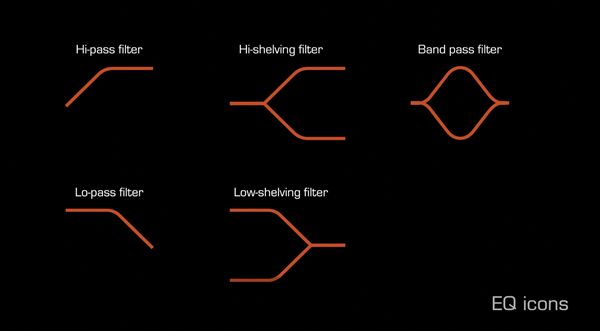
Caption - EQ icon
Many EQ devices use simple icons to indicate the type of filter and it's controls.
Caption - Thanks for watching
The script for this video, with accompanying images, can be found at projectstudiohandbook.com
We suggest you subscribe at our YouTube channel, and join our mailing list at our website to receive notification of new videos, blog posts and subscriber only extras.
Thanks for watching.